In collaboration with Fluent
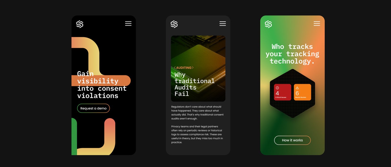
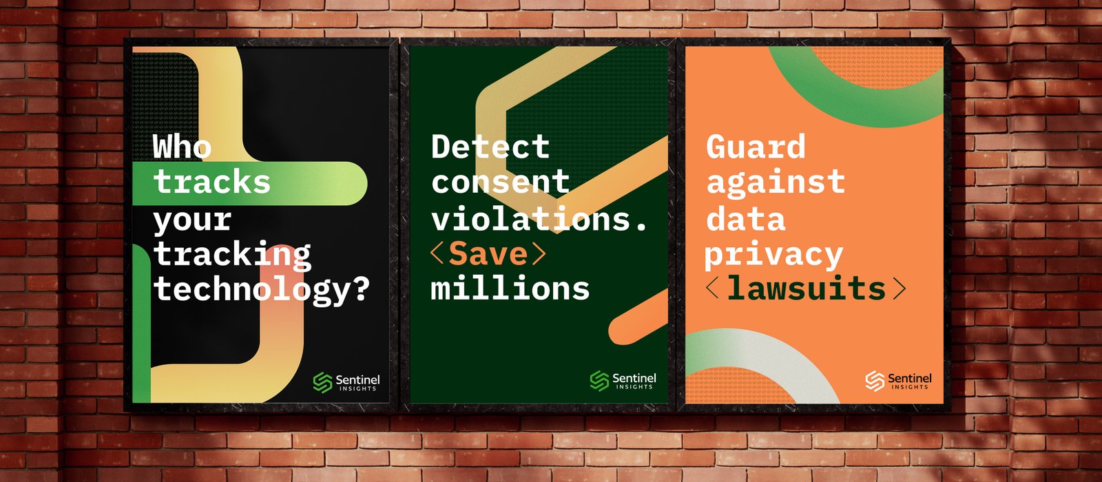
I evolved Sentinel's existing identity into a more approachable and distinctive B2B brand. Rather than starting over, I refined the logo, introduced a more fluid visual language, and developed a new color system that helped the brand stand apart from traditional SaaS companies. The work came together in just a few weeks.
Sentinel already had a strong foundation in its logo, but the overall identity felt more rigid and technical than the company wanted to be. As a B2B privacy and compliance platform, the brand needed to communicate trust and sophistication while feeling more approachable and modern.
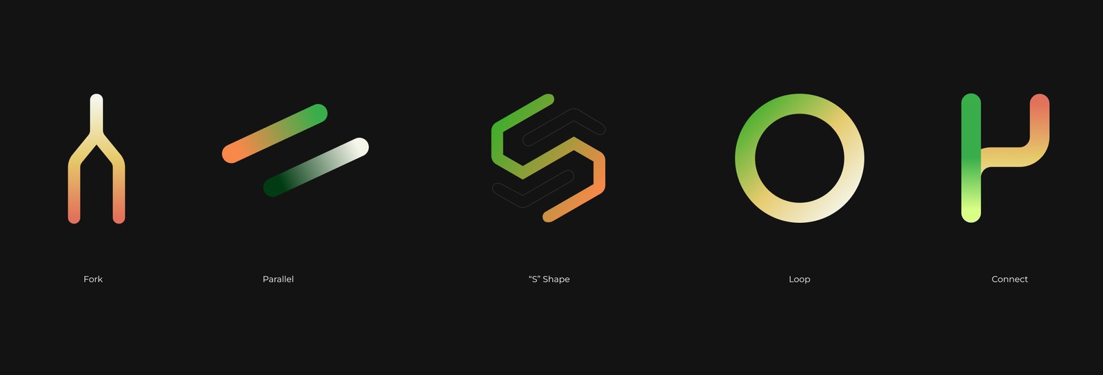
Rather than completely redesigning the logo, I looked for ways to evolve what was already working. I softened the sharp edges and introduced more rounded forms, creating a visual language that felt more fluid and approachable.
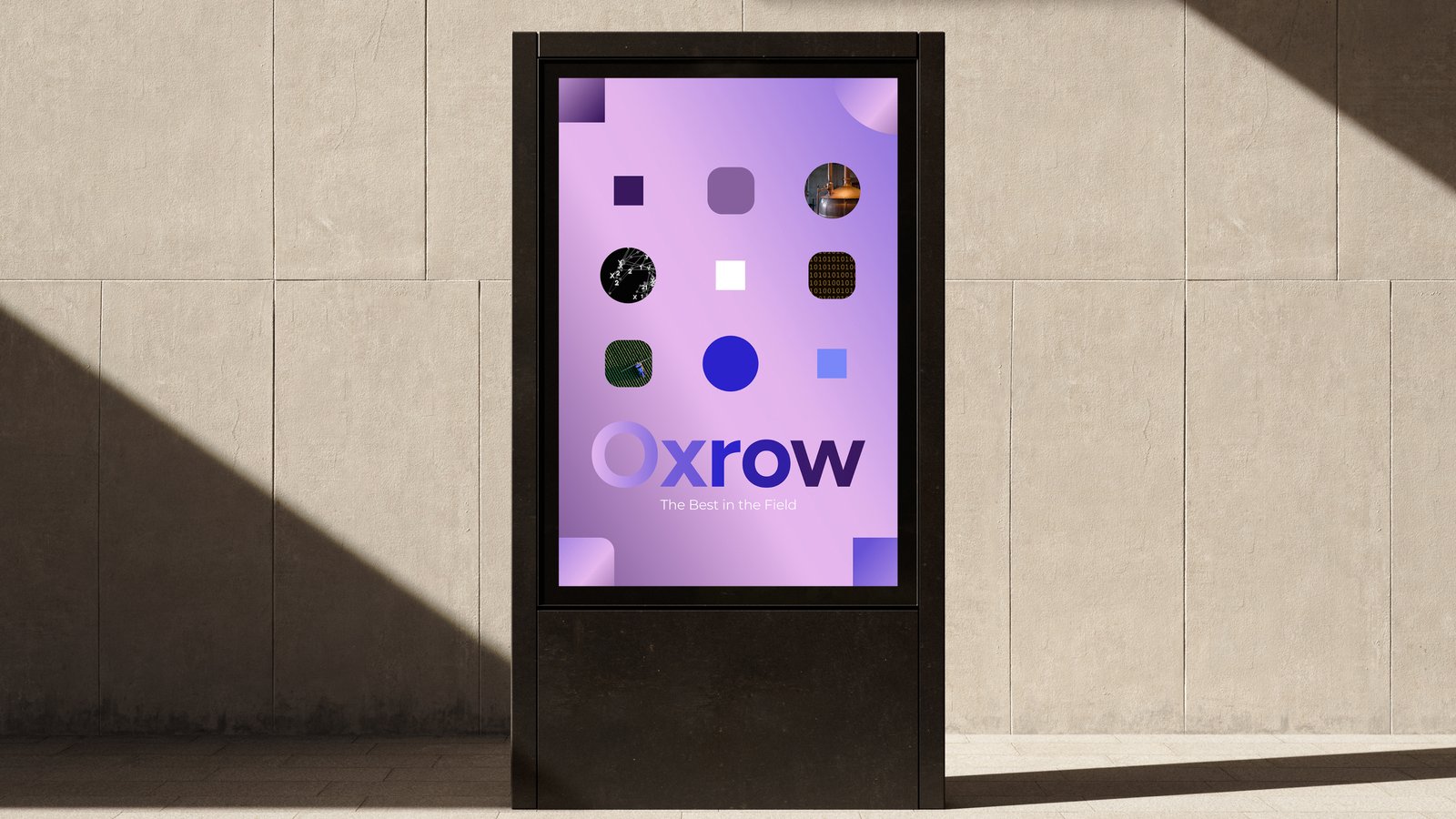
From there, I developed a system of shapes, gradients, and color that gave the brand more personality without losing the credibility expected from a B2B technology company.
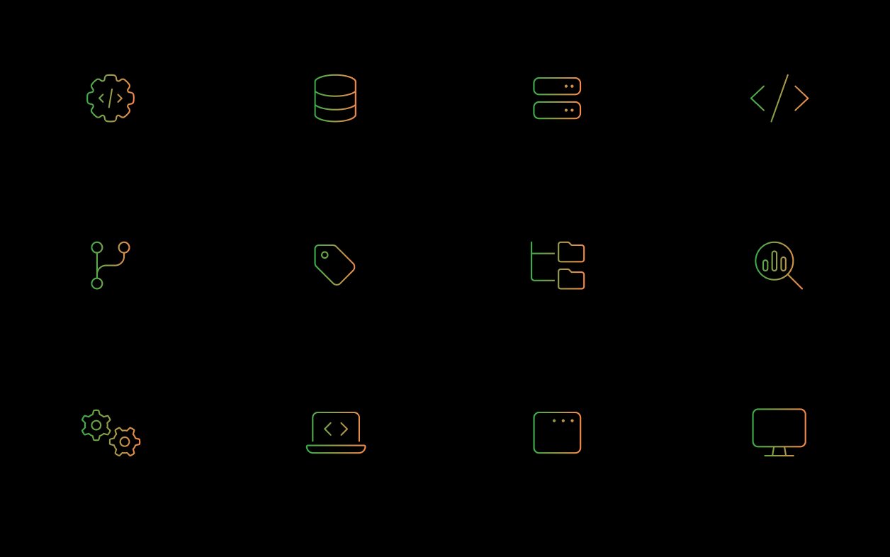
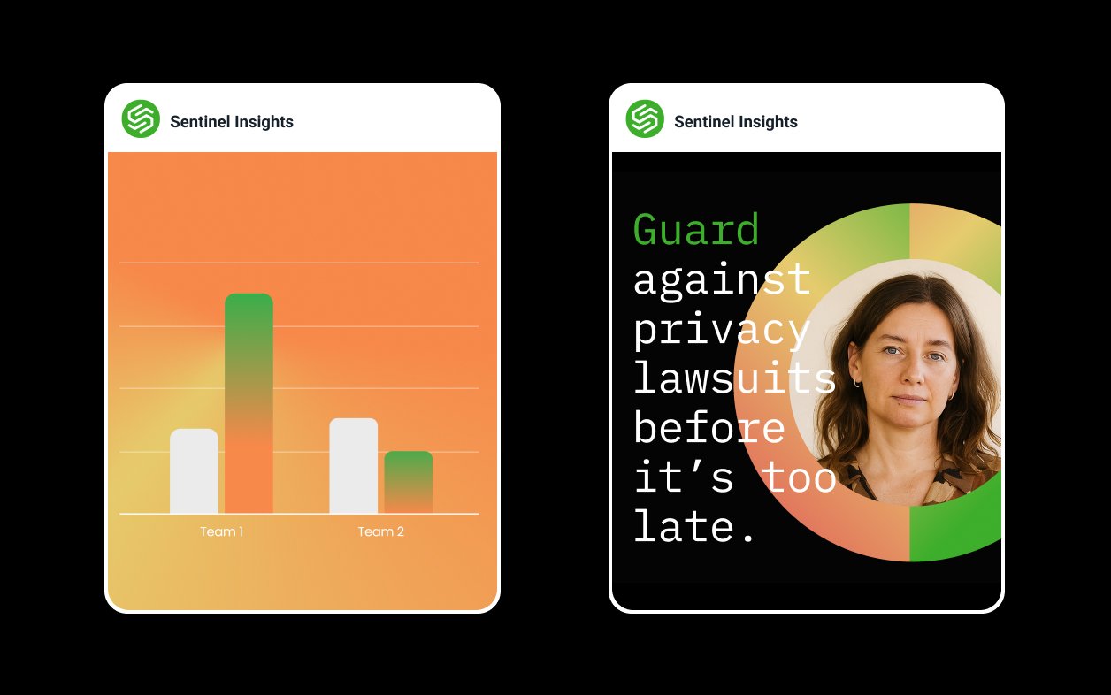
With a tight timeline, I developed the updated identity and supporting brand system in just a few weeks. Beyond the logo and visual direction, I created a set of reusable assets and building blocks that the team could use to create new marketing and sales materials on their own.
The framework gave Sentinel a more flexible brand system and made it significantly faster to create new assets.
"Fluent has given us a framework that makes it possible to create new marketing and sales assets 10x faster than before." — Sentinel Insights